Photo Credit: Akhila Krishnan

Photo Credit: Akhila Krishnan
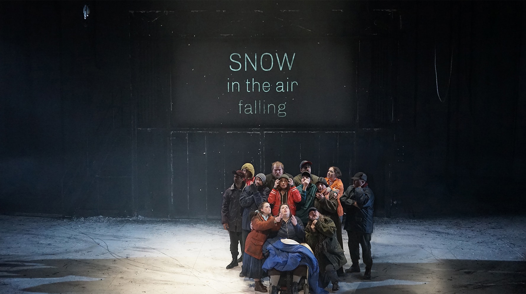
Photo Credit: Akhila Krishnan
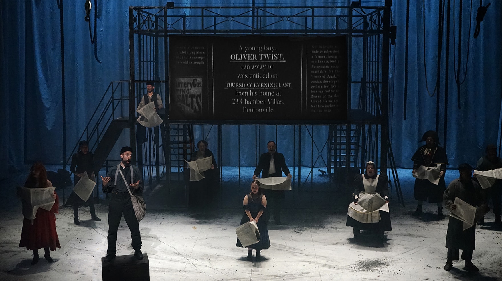
Photo Credit: Akhila Krishnan
Oliver Twist
- Animation
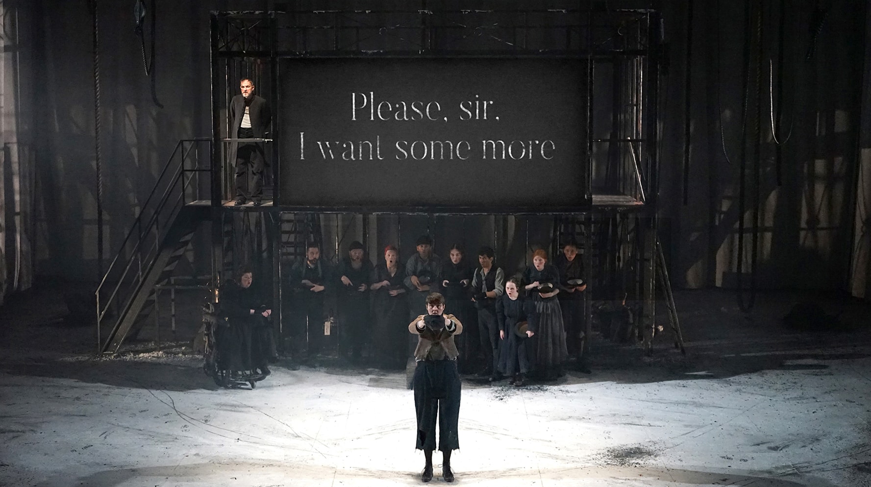
Oliver Twist is a co-production between Leeds Playhouse and Ramps on the Moon, the pioneering initiative from seven major UK theatre companies committed to putting D/deaf and disabled artists and audiences at the centre of their work.
Adapted by award-winning playwright Bryony Lavery, this new production of Dickens’ classic integrates creative sign language, audio description and captioning throughout the show.
The projection design centred around captioning; with 1300 cues fired live during each performance, the end result was an innovative fusion of accessibility and design.
My Involvement
I undertook work on Oliver Twist for Video Designer, Akhila Krishnan.
I was tasked with animating over 580 phrases of text that were projected on stage.
The challenge was creating mood through subtle effects; enhancing the scene without being an intrusive distraction.
I tried to imbue the animation with character. By taking care over the tempo and style of effects, I hoped to conjure the percussive quality of the spoken word.
Software
After Effects


Selected Press
“The choreography of the ensemble’s signing is as beautiful as the filmic surtitles, creating a celebration of community that contrasts with the story’s dog-eat-dog individualism…”
The Guardian
“Lavery’s words are supercharged and intensified by the presence of constant captioning, which cleverly intermingles with the atmosphere being generated by the performers and scenography to devastating emotional effect…”
WhatsOnStage
“A large central scaffold proves a flexible structure, acting as climbing frame, balcony, cellar entrance and workhouse gates alike. It also houses a large screen, on which beautiful captioning appears in support of much of the dialogue, fading and flickering like an early cinematic experiment.”
British Theatre Guide
“…features sign language, audio description and captioning which are not simply additional features, but rather are fully incorporated and woven into the artistry of the production.
A screen at the back of the stage doesn’t just caption the dialogue, but has a certain cinematic quality and interacts with the eerie and sinister atmosphere on stage.”
A Younger Theatre
“Communication is a central theme in Amy Leach’s production…the set consists of a scaffold on top of which sits a large screen on to which surtitles are projected. Sometimes they fill the screen, sometimes they appear at its edges, emphasising the way in which the lines are delivered…the aesthetic choices – high contrast, black on white – are also designed with visually impaired audience members in mind.”
The Stage
“It’s as if Dickens has been rewritten as a graphic novel full of brooding shadows and the occasional steam-driven wheelchair…
“The impressive steel scaffold (set) is dominated by a large screen providing captions. And it’s not just your usual ultra-functional prose — fonts of varying sizes mimic the emotions of the characters. Occasionally, we even get facsimiles of newspaper front pages and an echo of the penny dreadfuls of the era.”
The Times
Creative Team
Director
Amy Leach
Set Designer
Hayley Grindle
Projection Designer
Akhila Krishnan
Lighting Designer
Joe Fletcher
Composer
Oliver Vibrans
Sound Designer
John Biddle
Adapted for Stage by
Bryony Lavery
Projection Design Team
Animator
Georgia Clegg
Programmer
Stan Orwin Fraser
Verbatim Captioning & Video Cueing
Simon France
System Designer
Maximilien Spielbichler